I design for real use, not the happy path.
Product designer in Barcelona. Three years in B2B and B2C product, after four running delivery operations across four countries. That’s where I learned a product is judged on its worst day, not its best. It’s the standard I hold everything I design to.
Every school sold microphones. This one sells a craft.
voiceacting.es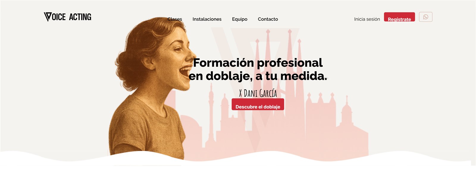
- Role
- Sole designer
- Year
- 2025 · live
A platform nobody knew where to start with.
nordwellcampus.spacecreator.io/spaces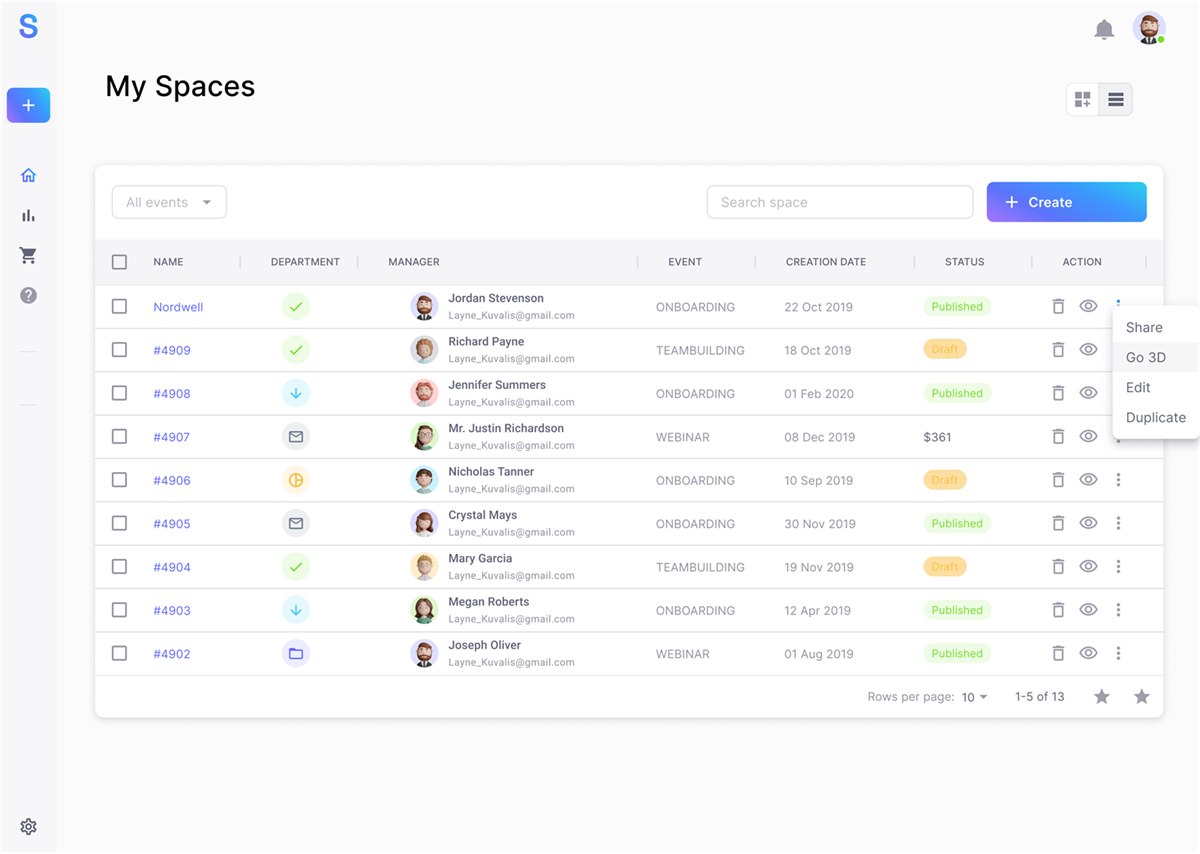
- Role
- Research and product
- Year
- 2023 · real client
Editing a saved document meant starting from scratch.
- Role
- Audit and interaction
- Year
- 2024 · design challenge
- Now
- B2B workflows for insurance operations
- Reach
- Close to ten markets
- Before
- Operations in the UK, IT, PT and ES
Voice Acting
Every school sold microphones. This one sells a craft.
Spacecreator
A platform nobody knew where to start with.
ScanNow
Editing a saved document meant starting from scratch.
Looking for a team where process matters.
B2B or B2C product, from internal tools to consumer apps. Hybrid in Barcelona or remote anywhere in Europe.
Every school sold microphones. This one sells a craft.
A dubbing school was opening in Barcelona and needed an identity, a website and a private area where students could buy and follow their classes. I was the only designer.
Every school led with its equipment.
New gear, expensive microphones, freshly built studios. Every school made the same pitch, so it no longer set any of them apart. In a whole category selling technology, nobody was selling the one thing technology can’t copy.
Sell the craft, not the room.
A restrained, grown-up identity that puts the craft and the people who teach it ahead of the catalogue. The facilities still get their mention, just third, and never at the top of the page.
What you’re buying, before you have to ask.
Three levels with the hourly price in plain sight, a monthly minimum and groups of six: everything a student needs to decide, without asking for their contact details first.
The recordings library that didn’t make it.
I proposed letting each student keep their recordings and hear their own progress. It was cut over storage costs. Today I’d rethink it to keep only the most recent sessions.
Outcome: it’s live. I don’t publish business figures for this project.
Spacecreator
A platform nobody knew where to start with.A platform nobody knew where to start with.
SaaS for HR teams with remote staff and high turnover. The problem wasn’t the technology. It was the way in.
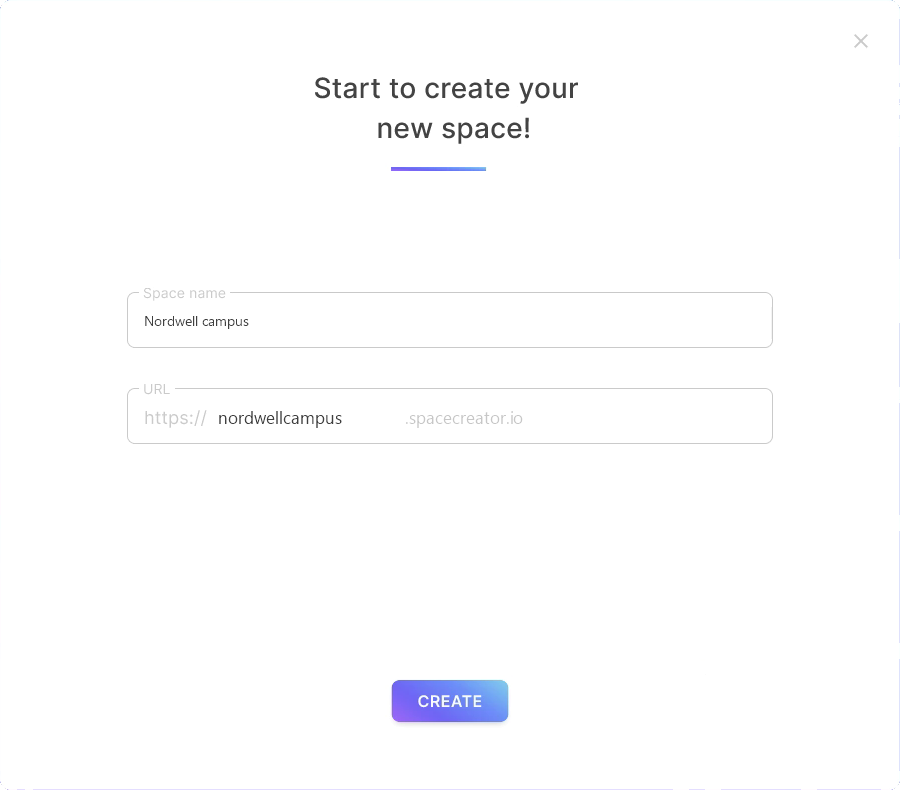
Spacecreator sells the platform; the people using it work at the client company, which sets up its own branded space inside. That’s why the screenshots show a company’s name rather than the product’s.
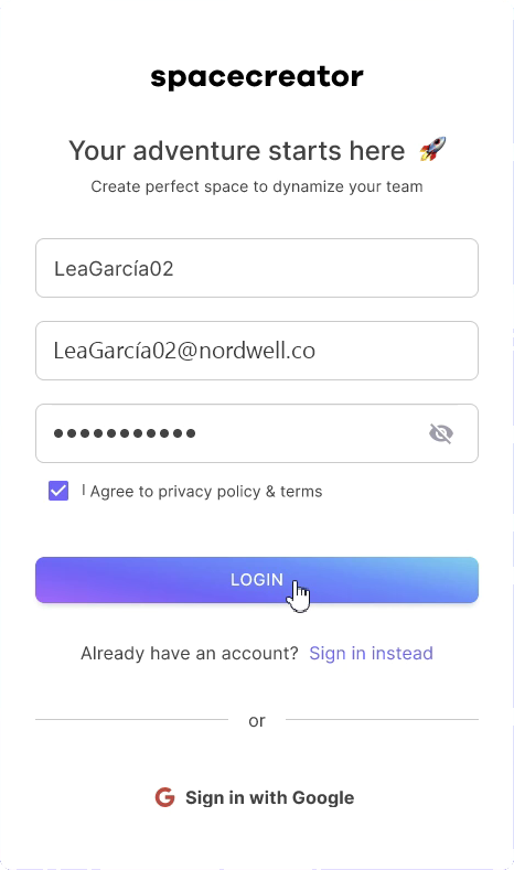
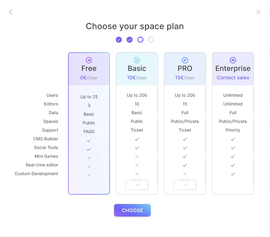
The account before the price.
In testing, people dropped off when the price came first. Flip the order, and whoever drops off at step three is already a lead.
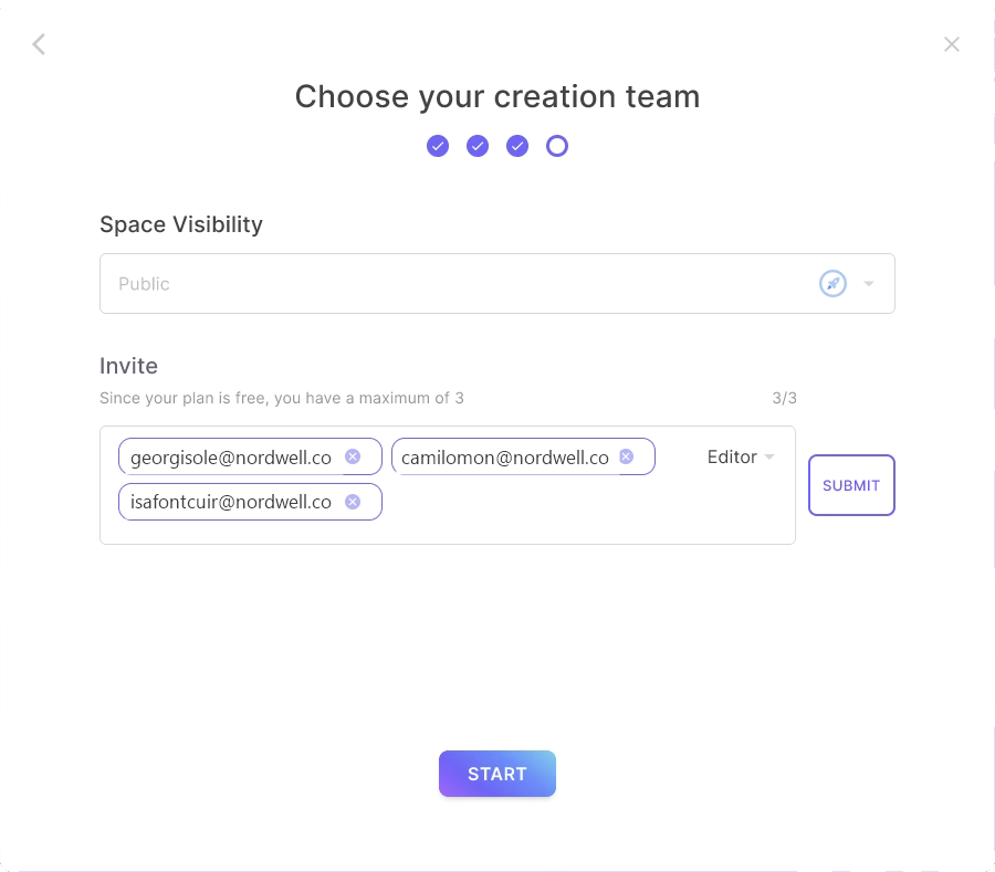
Waiting time, put to work.
While it loads, the product asks what the space is for, who it’s for and how many people will take part. Dead time becomes personalisation.
Five views, not one dashboard.
Overview, rooms, networking, connections and quiz. Each one answers a different question: who’s making progress, where people gather and who’s being left out.
Outcome: what I have are the test results. With the account before the price, anyone who drops off is already a lead.
ScanNow
Editing a saved document meant starting from scratch.Editing a saved document meant starting from scratch.
A usability and accessibility audit of a scanning app, with a proposal and a prototype. A hypothetical case, not a real app owned by whoever set the challenge.
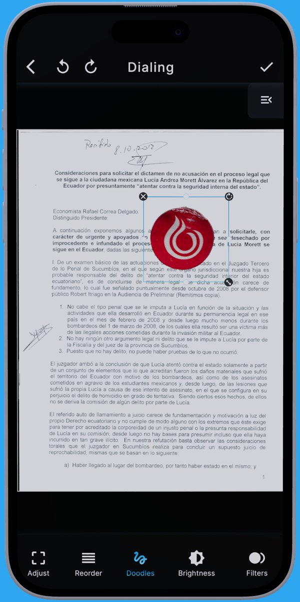
Remove the controls that did the same job.
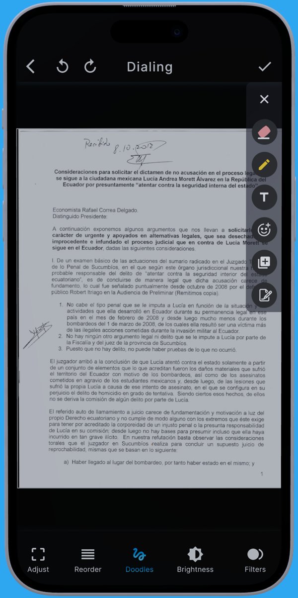
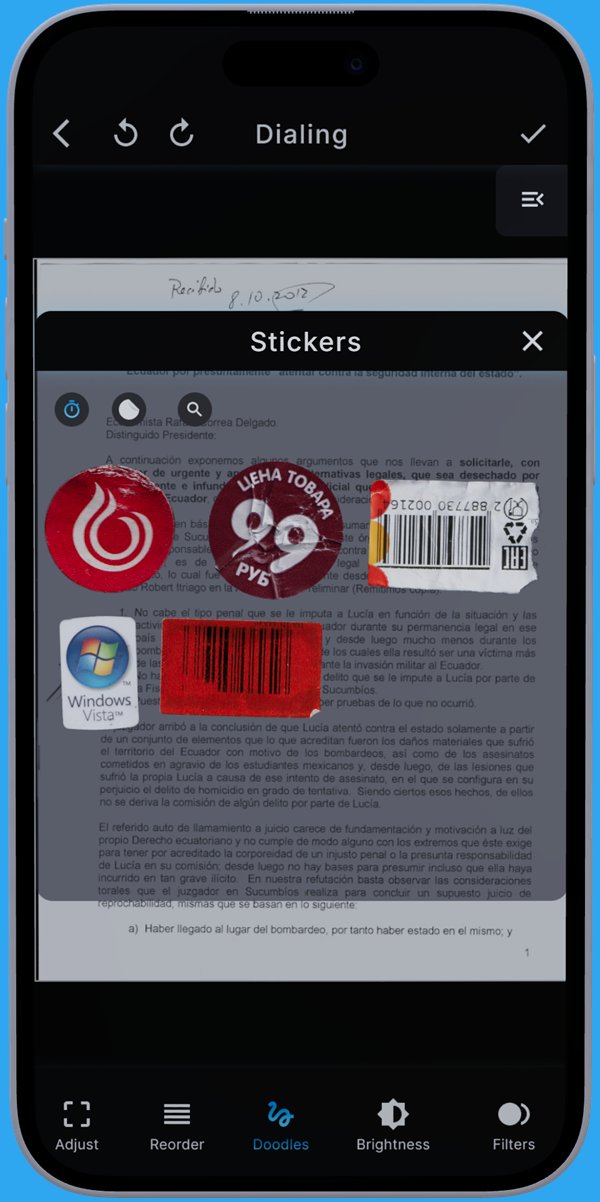
The bin and the cross did the same thing. Both went: to delete, you select the object and an icon appears on its corner.
A menu that doesn’t shift under your feet.
The main menu stays active and shows which section you’re in, with the tools in a side overlay that closes when you tap outside it. Fewer taps, and you always know where you are.
A paywall that makes sense.
Three plans, with the one the business most wants to sell highlighted, the full comparison in view and the call to action floating the whole way down.
The audit also found that text lost contrast when switching to dark mode.
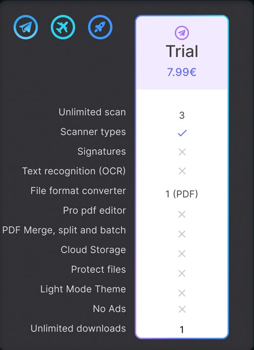
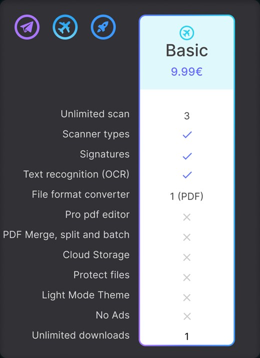
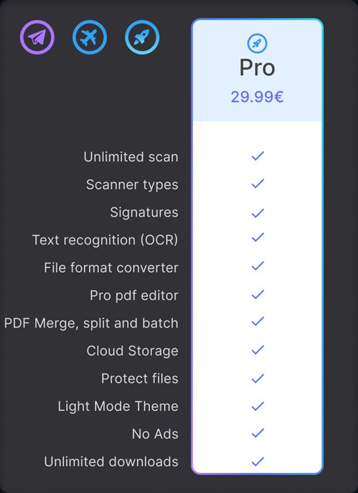
Outcome: this was a design challenge on a hypothetical case, with no business results to measure. What I delivered was the audit, the proposal and the prototype.
Voice Acting
Every school sold microphones. This one sells a craft.Five principles, and where I’ve applied them.
Users at the centre, business in the equation.
A design that forgets the business never ships; one that forgets the user never gets used. When the two clash, I put the tension on the table with data instead of settling it on my own.
At Spacecreator: the business needed the lead early, and testing showed that putting the price first scared people off. Reversing the order solved both. See the case study
Before I sketch, I listen to the people who’ll use it.
Requirements come from whoever commissions the project, but problems show up where the work actually happens. I check one against the other before I open Figma.
At Spacecreator: a heuristic evaluation and interviews with HR professionals before touching a single screen. See the case study
I design within the system that already exists.
You almost never start from zero. I work with the components, tokens and brand that are already there, and where there are none, I leave them set up for whoever comes next.
At ByteTheQuiz: I built the first components of their design system.
Constraints are part of the brief.
Budget, infrastructure and deadlines don’t spoil the work; they shape it. What counts is the alternative you put on the table when something can’t be done.
At Voice Acting: the recordings library was cut for cost. The alternative I’d put on the table today: keep only the most recent sessions. See the case study
Accessibility isn’t the last phase.
In insurance, banking and the public sector it’s usually a contractual requirement, not an optional extra. Contrast, visible focus and keyboard navigation go in from the first sketch.
On this very site: you can navigate all of it by keyboard, and it respects your reduced-motion setting.
- Tools
- Figma · Jira · Salesforce · Looker · Qlik
- Ways of working
- Agile · user research and testing · components and tokens · shipping alongside engineering
- In a team
- Today I’m one of ten designers on a platform whose flows reach close to ten markets
Four years in operations before three in product.
Camilo has been key in resolving critical situations, always willing to go the extra mile. I would recommend him to any company looking for a results-driven professional with great people skills.
Estelle PavretCustomer Success & Experience · translated from Spanish
Looking for a team where process matters.
B2B or B2C product, from internal tools to consumer apps. Hybrid in Barcelona or remote anywhere in Europe.
